Moni3's avatar

Moni3

298 Watchers151 Deviations
51.4K
Pageviews
I'm currently in a bizarre situation related to art theft on dA that needs to be discussed by dA's members and staff. I hope this helps spark a discussion among dA members at the least, and at the most, prompts a change in dA's policies or protocols.

A little about me:

I've been a member of deviantArt for more than 10 years. Not all of those years have been annual paid memberships, but I am currently a "CORE" member, which means I pay for the premium membership. Quite a few professional artists use dA to get Internet exposure, and I'm one of them. Since 2013, my network of friends and acquaintances on dA has grown due to my using the chat functions. I was a regular member at a channel called Sharezone, a place for artists to show off their art which is mostly defunct now, and I'm currently a regular at deviantArtShowcase. I have become friendly with a few artists at dA whose artwork, sense of humor, or other aspect of chatting I've come to admire and enjoy.

Sooner or later, in dA chats, the issue of art theft comes up. Users show up with art that is clearly not theirs, or they've taken a good image somewhere and run it through a terrible Photoshop filter that fools no one. I have never reported another dA member for art theft, but others I know through dA chat have. As I understand it, the response from dA staff has been lackluster to nonexistent, so any action that reflects official disapproval comes from individual chat channel moderators, whose stances on art theft vary from person to person, channel to channel. Why is official disapproval of theft important? It sets the tone for this artistic society. Through negative reinforcement or punishment (i.e. criticism or action), it relays the message to art thieves that certain actions are intolerable to this society. When no action is taken, it relays the message that art theft is tolerable and insignificant. 

The provoking incident:

Crabamoustache is one such artist I've come to know through dA chat. He's a fun cartoon artist whose work should be checked out by everyone. His passion is cartoons and comics, and we've had a few discussions about the artistic worth of this kind of art, as well as other forms of art neither of us practice much. I am definitely not a cartoon artist, but I respect the impact cartoons and comics have on art and culture. 

One day in January 2016, Crabamoustache did what most digital artists must do (but dread, I'm sure): reverse googling their own artwork to see if any of their work is being used somewhere on the Internet without their knowledge. Crabamoustache found a lot, unfortunately. His own stylized renderings of the famous cartoon character Felix the Cat (created by Otto Messmer, now deceased) were being used by an Italian soccer club, sold by an American gear shift company, and a t-shirt shop based in the UK. I would provide a link to this Felix deviation here, but I cannot, and the reason why is part of the story.

Well, how does an individual artist proceed from here, when he finds his work being used by others without his knowledge or permission? First, an artist or copyright holder asks him/herself what harm is being done? Am I losing out on money I should get because I did the work? Is this actually bringing me more exposure, benefitting me in the long run? In the case of the Italian soccer club, they are using it as a team logo, not necessarily mass producing it for widespread sale. Although Crabamoustache received no credit or compensation for his artwork, the loss from the soccer club using his Felix rendering is negligible, so he never contacted them. 

However, it became clear that his Felix rendering was being mass produced for sale by the t-shirt company based in the UK, and the American gear shift company. So Crabamoustache took a reasonable step. He found the Facebook page of the t-shirt company in the UK and asked them why they were selling his design in their shop. The shop responded by deleting his comments.

This is where I step in. Crabamoustache wrote on his Facebook timeline about the situation in frustration. Another artist friend and I both contacted the t-shirt shop's Facebook page to say plainly that this design belongs to someone else, you're using it for your own profit, and you need to stop. Crabamoustache's deviation was linked in the comments. The upload date is on every deviation, as it was with Crabamoustache's Felix rendering, which was loaded to deviantArt in 2009. Also telling is the fact that Crabamoustache signed his Felix rendering with his initials, and that signature was part of the t-shirt design! Within the hour, however, all the comments regarding Crabamoustache's design were deleted at this t-shirt shop's Facebook page.

I had the good sense to take screen shots of every step along the way, which is relevant to the story. Here, you can see the comments made by krasblak, including the link back to Crabamoustache's deviation. Crabamoustache's design is on the shirt to the far left. I'll call this Exhibit 1, because it is part of the story:
  Facebook Artjunkie top comments by Moni3
(Imgur mirror image)

Here are my comments to the t-shirt shop's Facebook page:
Artjunkie Facebook lower comments 2 by Moni3
(Imgur mirror image)

Escalation of this incident to harassment:

Within a couple hours of all comments being deleted at the shop's Facebook page, someone under the name styleiocn [sic] appeared at the deviation to accuse, in near gibberish, Crabamoustache of stealing the Felix design from the UK shop:

Artjunkie response to Crabamoustashe on dA under S by Moni3 
(Imgur mirror image. Note the copyright message verified that this image was uploaded in 2009.)

And those doing the accusing of harassment:

Styleiocn Artjunkie comment on Felix deviation by Moni3  Artjunkie comments on dA 2 by Moni3  Artjunkie comments on dA 3 by Moni3  Artjunkie comments on dA 4 by Moni3  Artjunkie comments on dA 5 by Moni3
(Imgur mirror images 12345)

All of these comments are available to read at the deviation, which is available to dA staff.

styleiocn's account was created that day. The account loaded no art. I also loaded, as evidence, a screenshot of this UK shop's further theft of the Anheuser Busch logo, the most popular beer manufacturer in the U.S., which the shop put on a t-shirt and advertised on their Twitter feed as being for sale. For a point in this story, I'll label this image Exhibit 2:

Artjunkie Anheuser Busch logo design Twitter by Moni3
(Imgur mirror image)

Here's Anheuser Busch's website, where you can see their logo. After seeing that styleiocn accused Crabamoustache of stealing the Felix rendering, I then wrote to Anheuser Busch to let them know that their logo was being used without their permission. You'll also notice Crabamoustache's design is used as Artjunkie's avatar on Twitter.

I inserted the thumb image showing the Anheuser Busch design t-shirt into one of the comments in that exchange with styleiocn, hoping to provide proof to deviantArt staff, should it come to it, that styleiocn is taking the designs of major corporations as well as individual artists. 

You can see the exchange between styleiocn and other accounts went back and forth for a while. This occurred on Saturday, January 16, 2016. The holiday for Martin Luther King, Jr.'s birthday fell on the following Monday, so as expected, deviantArt staff was unavailable to respond until Tuesday. styleiocn threatened to file DMCA complaints against me and Crabamoustache. I did not take these threats seriously because they were delivered in the same near-gibberish, and there's simply zero reason for dA to delete a screenshot of an image being used on Twitter as an advertisement for a product that the complainant clearly did not design! In my sta.sh!

deviantArt's response:

But on Tuesday, January 19, 2016, dA staff performed the following actions:
1. Deleted Crabamoustache's rendering of Felix the Cat per styleiocn's DMCA complaint, which should be located here, but is "404 unfound" as of this writing on January 25, 2016.
2. Deleted my screenshot of the Facebook comments seen in what I titled "Exhibit 1" from my sta.sh. I reloaded this image knowing the complaint was bogus. The screenshot of my comments to Facebook was not deleted, probably because I never posted it in any discussion and styleiocn did not have the link to claim it was his design. 
3. Deleted my screenshot of the Twitter posting of the t-shirt featuring Anheuser Busch's logo, which I labeled "Exhibit 2" from my sta.sh. I reloaded this image knowing the complaint was bogus. A screenshot of the upper portion of the tweet, showing the full text of Artjunkie's discount offering, was not deleted from my sta.sh, probably because I never posted it in any discussion and styleiocn did not have the link to claim it was his design. 

On Sunday, January 17, 2016, I learned through helpful Google, that styleiocn/Artjunkie Boutique is run by a man named Anthony Knight, who has been sued at least twice before for using designs without the original artist's permission or knowledge. You can see in these links:

a. June 2, 2009: Summary of the lawsuit brought against Knight by designer Vivienne Westwood. 
b. March 26, 2012: 
Knight is threatened with jail time for not complying with court orders to return domain names and clothing with designs owned by Vivienne Westwood.

By this point, it's clear that Knight/Artjunkie/styleiocn has no ethics whatsoever and has abused the DMCA complaint process at deviantArt on top of profiting from other designers' work.

It's also clear that deviantArt staff has done no critical thinking, and the default action in any DMCA complaint is to delete any and all images that receive a complaint without verifying any part of anyone's claim of original work. For Crabamoustache's Felix rendering, let's say that's a "better safe than sorry" reaction on dA's part. I have some of my own fan art in my dA gallery. However, Felix is owned by Dreamworks (proof here) so there's no way styleiocn/Artjunkie/Knight can claim ownership of the original character. Nor, apparently, can he prove he created the stylized Felix "fan art" design in question, as we pressed him to do so repeatedly. Crabamoustache's gallery has a dozen or so Felix renderings, all loaded in 2009. Fan art is pervasive on dA, and the finer points of what makes fan art vs. what makes original art should be discussed in another journal entry.

For my sta.sh screenshots, dA's approach simply makes no sense. Files/images in sta.sh are not public and can only be accessed with a direct link by non-dA staff. I keep a lot of progress shots and original reference photos in my sta.sh. No one can see the images but me, unless I presume, they are dA staff, or I give them the links. I provided thumbnail images (that I labeled herein as Exhibit 1 and Exhibit 2) in the discussion under Crabamoustache's now-deleted deviation, which is how styleiocn/Artjunkie/Knight came to find the links. Furthermore, styleiocn/Artjunkie/Knight cannot claim that a screenshot showing a window in Google Chrome, Facebook's layout and comments function, comments made by another person, and the "Artjunkie" designs within the layout are entirely his. He did not create Google Chrome, Facebook's layout, nor the comments written to him. The screenshots include the entirety of the image, not simply the t-shirt designs, assuming he actually designed any of them which by this point is quite a cognitive leap. This should be apparent to dA staff. What should be more apparent is the screenshot of Artjunkie's Twitter feed. Similarly, styleiocn/Artjunkie/Knight cannot claim that he designed the window as seen in Google Chrome, or Twitter's layout, or Anheuser Busch's logo on a t-shirt. 

Latest developments:

As I write this on January 25, 2016, it has been nearly a week since my two images and Crabamoustache's rendering of Felix have been deleted. styleiocn/Artjunkie/Knight's Facebook page has been deleted. I don't know who is responsible for this action. Anheuser Busch responded to my notification with email confirmation that they were unaware their logo was being used by styleiocn/Artjunkie/Knight. I am happy to forward this to dA.

I sent emails to dA's Help Desk and violations@deviantart.com explaining how brazenly styleiocn/Artjunkie/Knight is stealing art from dA and abusing the DMCA complaint process, including the links and images that I embedded in this journal entry, on January 19. Crabamoustache filed a DMCA counter claim the next day. Neither of us have received any correspondence from dA, other than a receipt of acknowledgment for our emails. I do not know what is taking so long to figure out what is an obvious case of theft and DMCA abuse.

DeviantArt has further deleted another of Crabamoustache's designs that should be located here but shows as "404 not found". That specific design is another Felix rendering that, coincidentally, was the one being used by the American gearshift company. I left a note on their Facebook page as well, but it has gone unanswered. I can only speculate that styleiocn/Artjunkie/Knight is somehow involved with the American gearshift company. Whatever the connection, the DMCA complaint is false and obviously an abuse of deviantArt's protocols. 

For future discussion, dA seems to have a "three strikes rule" where your account may be deleted after three DMCA complaints. If this is accurate, it means any deviant's account may be summarily deleted regardless of the veracity of the complaints. I could, in theory, file 4 bogus DMCA complaints against any random deviant and that account will be summarily deleted. The finer points of this policy is for a future journal entry, however.

spyed SGonzalez makepictures aunjuli damphyr Ikue moonbeam13 realitysquaredHeidi marioluevanos seoul-child madizzlee techgnotic bittygirla jeanpat rachelpitler JenFruzz
Join the community to add your comment. Already a deviant? Log In


I'll be attending the Queen of the Prairies Festival of the Arts in Sedalia, Missouri on September 26, 2015. I'll have a booth selling originals and some prints. If you're nearby, stop and say hello. 

Some of my work that will be for sale:


Cloud Horizon by Moni3  Boonslick Regional Library, Sedalia by Moni3  Bothwell Lodge Vestibule by Moni3  Hotel Bothwell on a Summer Afternoon by Moni3  House on the Corner, Sedalia by Moni3


Here's more about the festival.

Join the community to add your comment. Already a deviant? Log In
Community Week

Since the early 20th century, when painting began to stretch the boundaries of what we consider artful, or even art itself, the language we use to describe art, and therefore the way we think about art, has become so muddled that it is not uncommon to read commentary about art and feel that you need an art degree, yet not the technical skill associated with art, to understand why a particular work of art has value. These ideas are condensed from this version of a journal entry I wrote recently, in which I am rethinking how everyday people can express confidence in what kind of art appeals to them. It includes some considerations that generally do not seem to be mentioned by authorities on art: museums, critics, writers, and artists themselves, who often speak about art in such jargon that it begins to lack any practical meaning. I consider myself relatively well-educated and very interested in art, but reading critical theory about art often feels like a perplexing joke.

Maybe it might help to overview how people judged art in the past. Up to the middle of the 19th century, a regular person in the Western world might approach a work of art, and ask themselves:
1. Is it beautiful? 
2. Can I afford it?


The answer to the second question was almost always a no. Art was still made for people who could afford it, a class of people with more money. There was no significant middle class and no real way to mass produce prints. If people had art hanging in their homes, it was almost always locally made, if not made by a member of the household. But with the industrial age came a growing middle class. Coincidentally, technology advanced several factors that changed art in the 20th century. First, photography became available to amateurs, so people could shoot images of their loved ones and the land around them, creating a crisis of purpose for artists: why paint portraits when a camera can do the job more cheaply? Why paint landscapes? And secondly, prints of artworks became available and affordable to a wide population.

This crisis of purpose was answered by many artists in the 20th century by taking the elements of painting that made sense for centuries, and bludgeoning them into some unrecognizable form. Cubism, surrealism, and abstract expressionism began to dominate canvas paintings, and the response from critics directly opposed the response from audiences. Critics grew to love it. Audiences seemed to hate it. The result, still very relevant, is an audience of people baffled by art, and a group of authorities in art who assert amongst themselves what has value. Today, someone might go to a gallery or museum, approach a work of art, and ask themselves:
1. Is this art?
2. Is it good? (What do the experts say?)
 

It's time, however, to change these questions for everyday people. Any time spent at deviantArt shows that audiences are still greatly moved by elements of traditional art like portraits and landscapes, even if the medium is digital. People still respond to basic human connections in art. We consume art more than ever, and the divide between critics and audiences seems just as wide. So, what if we changed the questions we ask about art, directing those questions not to writers, authorities, and critics, but to ourselves?

1. Beauty: Is it beautiful? Do I have a positive physical response to the image? (Note: even macabre themes can be beautiful to some people. As ever, beauty is in the eye of the beholder, you.)
2. Challenge: Does this challenge me? Does it provoke, puzzle, frustrate, repel, or confuse me, make me question my beliefs about beauty or art? 
3. Design: Can I display it? Is it practical? Does it have a function or is it so offensive, large or ungainly that I would be embarrassed hanging this in my living room? How well does it fit the rest of the decor?
4. Emotional impact: Does it move me? What kind of emotional response do I have when I view this?
5. Identity: Do I identify with it? Does it remind me of home, or make me feel like I belong in a specific group?
6. Skill: Is the artwork skillfully made? Can I tell it took the artist some technical proficiency to complete?


Six categories of factors to help you, the viewer, judge whether a specific artwork is appropriate for you. These questions do not have equal importance. Some factors are more important to you than others. You may appreciate being challenged more than a looking at a work of technical skill. You may be more concerned with how a piece of art looks in a room rather than how much it moves you. You may prioritize art that represents your identity over art that frustrates or puzzles you. Moreover, you may prioritize your identity now, but find you do not need to later in your life, and subsequently, change your opinion on what you like to see in art.

Below, I've provided six images of artworks. First, prioritize the questions: which are most important to you? Beauty over challenge? Skill over design? Then, for each artwork, answer each question about beauty, challenge, design, emotional impact, identity, and skill with a yes or no. If you'd like to make it more mathematically complex, rate each question for each artwork on a scale of 1 (low response) to 10 (high response). Why did you answer the way you did?


Not only is it possible to change the dialogue about art and the dependence upon expert opinion to help us judge what we like, we can determine how important these factors are to us individually, we can notice how their importance changes as our lives change, and we can use them to set goals both as art consumers and artists.


Join the community to add your comment. Already a deviant? Log In


Since the early 20th century, when painting began to stretch the boundaries of what we consider artful, or even art itself, the language we use to describe art, and therefore the way we think about art, has become so muddled that it is not uncommon to read commentary about art and feel that you need an art degree, yet not the technical skill associated with art, to understand why a particular work of art has value. Authorities on art: museums, critics, writers, and artists themselves often speak about art in such jargon that it begins to lack any practical meaning. I consider myself relatively well-educated and very interested in art, but reading critical theory about art often feels like a perplexing joke.

So this is a way for you, as an individual, to take back your art so to speak. Legitimize why you like what you like. Put to words what appeals to you, and maybe stretch your boundaries a bit. I tend to favor traditional arts because I am a painter, but consider this guide applicable to any and all visual arts. 

Moni's first rule of art appreciation: Don't listen to anyone else tell you what you're supposed to like. Just don't. Art appreciation is subjective. Because of that, you really need no other authority than your own reactions to what you're viewing. Instead, I've broken down reactions to art into six major categories. Sometimes I prefer to apply rating scales, mostly for decisions that are difficult for me to make, but usually end up being more about what I would like to have for dinner. For this introduction, try using a standard rating scale between 1 and 10, with 1 being the lowest and 10 the highest. After my explanation, I'll take a look at a classic piece of art and show you what I mean.


Beauty: Steadfastly, I'm going to assign this as the most important because I think it's the most important. Notice the theme. This is my subjective scale: what makes the most sense to me. Obviously not every artist is going to consider beauty to be the most important factor in appreciating a work of art, but I certainly do. Do you consider a particular work beautiful? This might be a bit of a journey for you if you cannot answer because you simply don't know what beautiful means to you. You might have to figure this out for yourself. Remember though, don't let someone else define beautiful for you. Imagine stepping into a room or turning a page and being overcome, almost to the point of tears or your knees buckling, upon viewing an image. Your reaction may be physical like this or more intellectual, as joy washes over you when you see something you have never considered before.  

Rate a work of art between 1 and 10. 

Here's Andy Warhol's "Silver Car Crash (Double Disaster)", which recently sold at auction for $105 million. I would give a 1 on my beauty scale. I do not find it beautiful. It creates no physical response in me. 

In contrast, here's Salvador Dali's "The Discovery of America by Christopher Columbus", which I have seen in person, and in fact I did actually turn a corner and feel my knees buckle and my throat close up upon seeing. I've been to the Dali Museum in St. Petersburg, Florida a few times and this painting affects me this way every single time. I would score this at a 10.

Challenge: The rest of these factors vary in importance and have no significance in how they are listed. Some of them are more important than others according to different people. So let's take a look at what each means and the constant jostling of which factors are more important may keep you as interested in art as it does me. 

Does a piece of art challenge or provoke you? Does it puzzle, frustrate, repel, or confuse you to the point that you cannot stop trying to figure it out? Standards of beauty change from one culture to another, and are different from one era to the next. What Renaissance artists found beautiful is not necessarily what you might find beautiful, but more importantly, what Renaissance artists found shocking or frustrating may be vastly different from what you do. Using a more modern example, art installations challenge our perceptions of reality and sometimes sociological functioning. I'm going to stick mostly with visual art for my examples:

Here's one of Frida Kahlo's many self portraits. Kahlo accentuated her heavy eyebrows, facial hair, and darker complexion to challenge standards of beauty in women. She was drawn to indigenous Mexican cultures and tended to favor their modes of dress and style when popular culture in Mexico and elsewhere favored lighter skin and hair, and delicate features. I would score this particular Kahlo portrait a 7 out of 10, because I am as influenced by common standards of physical beauty as most other people and my immediate reaction is to consider Kahlo ugly and wonder why she would accentuate what most women try to cover or remove. Kahlo forces me to reconsider my own standards of beauty, and I respect her work for that.

In contrast, a work of art that sets a standard of beauty, like Michelangelo's David sculpture, captured male beauty quite well and continues to be used as a standard. I would score David a 2 out of 10 for being challenging.

I would reserve a 10 out of 10 for a work of jaw-dropping frustration that provokes the viewer (i.e., me) to sputter, "Is this actually art?" For example, a woman who displayed five years of used sanitary napkins, and for obvious reasons, I have no explanation for that. 

Design: Twentieth century painting made this factor of appreciation necessary, particularly for works that lost all form. Someone, somewhere, and probably a lot of someones, have created the ideal that art should be created for its own sake. Maybe it's my middle class background interfering here, but there's very little practical execution and purpose for art for its own sake. Artists don't eat ideals, nor use them for shelter. Artists need to make a living, so many works of art are tailored for practical use. Can you actually put a particular work of art in a room? Does / can it match the furniture or is it so impractical that you cannot display it? Are you comfortable showing it to your in-laws, your boss, or someone of importance who comes over for dinner?  

I'm developing this assessment method, this guide to art appreciation for myself too, you know. Twentieth century painting went through a baffling period where form was tossed out the window in favor of ... something else. Because photography was reaching a lot of people at once with personal cameras, typical easel painting like portraits and landscapes were replaced by paintings of nothingness. The splatters of Jackson Pollock, the canvases of Mark Rothko dominated by a single color, or a minimalist shape on a background of a contrasting color, as Barnett Newman did; these paintings go great with the furniture. So do the mass produced prints of sailboats, ducks, and pastel flower vases you might find in doctor's office waiting areas, offices common areas, and hotel rooms. They are admirably practical and for the most part, visually inoffensive. They go with just about everything. 

A work of art you would keep in your bedroom only, or you would display for its shock value alone because that's the way you roll, would receive a low score for design. 

Emotional impact: In sharp contrast to a work of art that scores high in design may score very low for emotional impact. It is not necessarily so, but more often than not, something that elicits a strong reaction from the audience may turn out to be a centerpiece in a room, the source of discussion and maybe argument. 

The dividing line between beautiful and emotionally powerful is difficult to locate, but something can be beautiful without being too emotionally powerful, and vice versa. That may be another journey for you, testing where that line is for yourself. 

Here's Picasso's "Guernica", named for the city in Spain that was bombed by Nazi forces during World War II. Picasso captures the chaos and violence ruthlessly in this piece, yet it is not a beautiful painting. It wasn't really meant to be. It is a striking work of art that I would rate at 8 out of 10 for emotional impact. Artemisia Gentileschi's "Judith Slaying Holofernes" gets a 10 out of 10 because it is so powerful my brain just shuts down and all I can hear in my head is swearing.

Art that scores low here is simply a work that doesn't affect you. Everyone has his or her own defining line. 

Identity: This factor has been completely overlooked by art authorities, which is a shame. Before the mid-19th century, there wasn't much of a middle class anywhere in the world, so art was made for and purchased by people who had the most money. But the 20th century brought a lot of changes, especially in economics and class. Suddenly, art became available to a large middle class. It became popular, meaning audiences quickly became very large, and artists could mass produce for those audiences. 

With that growth of mass audience were pockets of people who identified with a particular group. Maybe race, class, location, occupation, or gender are important to you, the viewer. Let's go farther. The logo of your favorite sports team would score very high on identity because you are a fan of that team. A photograph of your favorite musician. A rendering of a scene from another medium, like television, film, comic books: fan art. Something about a piece of work makes you identify strongly with it. Landscapes may be beautiful, but they often mean more to the people who live near where the landscape is set. Where a landscape fosters affection and belonging for someone who grew up in that region, it may do nothing for someone else. 

I paint in a room without any art on the walls, except for one piece. Most of that is practical: anything covering the walls will change the light in the room. The only piece of art hanging on my studio wall is the film poster for Mulholland Drive, a film by David Lynch, because I really like that film to an alarming degree. Only you know what you identify with, and only you know if your identity is important enough to express through the art on your walls. 

Skill: The placement of this factor at the end reminds me to reiterate that aside from beauty, there really is no order to the importance of these qualifications. I appreciate technical skill, but that is possibly because I am an artist and I know how difficult it is to render figures accurately. Skill has lost a lot of weight with twentieth century painting, in the aforementioned splatters, single colors, and minimalist shapes. It's a shame really. We tend to approach art as a puzzle, something to figure out. The first, most obvious answer can't be the real one, can it? Well, yes. Simple paintings are often very skillfully done. Sometimes deceptively so. This may be the most obvious factor to score. Do the figures in the work make you believe they exist or they could? Are the shadows logical to where the light is? Is perspective logical? This may seem to favor realism, but it's not necessarily meant to. It can apply to fantasy, science fiction, surrealism, and impressionistic images. 

But for example, hyperrealism is a growing style of painting that exhibits an extraordinary amount of skill, but may not be accompanied by any message and absolutely no challenge. The skill involved is the art itself. The artist is showing off, sure, but who really cares when the details are mind blowing and so enormously impressive?

Figures that are uncanny, or that you can tell are slightly off or really off even though the artist was attempting accuracy, would be scored lower. I would also consider works of art where you cannot tell what level of skill was needed to complete the piece to be scored low: paintings done by animals, children, and artists with the same effect.


When I judge art for my own tastes, I tend to place importance on these six factors in this order, with this emphasis:

Beauty

Skill

Emotional impact

Challenge


Design
Identity

In other words, design and identity are not really important factors for me, but they are very important for other artists and art appreciators. Beauty is the most important, as I have said. Skill and emotional impact have about the same weight, but I tend to appreciate skill a bit more. I enjoy being challenged a bit, but not to the point that it just makes me angry that used sanitary napkins are considered art. 

How would you place these six factors in order of importance for you? Which have the most emphasis, and which the least?

So here, as I said I would do, I'll assess a work of art known to everyone: the Mona Lisa by Leonardo da Vinci. It's no stretch to consider it the most famous and perhaps the most beautiful painting, or at least the one most people think of when they think of fine art. (Also, I can use it here because it's in the public domain and I won't get in trouble.) Once more, don't let anyone tell you what to appreciate. Figure it out for yourself.

Mona Lisa by Moni3

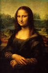
 How would I score this work of art?

Beauty: 8/10 with very little explanation necessary. Unless you require one, then by all means tell me and say why.
Challenge: Aside from the abiding question of what is she smiling about and why am I not in on the joke? this painting's own fame cancels any challenge in my lifetime. It may have been challenging for viewers when it was first revealed, but because it is so common a standard for fine art, it is no longer challenging. 2/10
Design: Does it go in a room? Absolutely. 9/10
Emotional impact: Again, this painting's own fame lessens its emotional impact for me. 1/10
Identity: I don't really identify with the woman or the landscape behind her. 1/10
Skill: Well, it's da Vinci and I can't reproduce this which frustrates me, so 10/10
 
Here's another one, a bit less well known: William Adolphe Bougereau's Dante and Virgil in Hell:
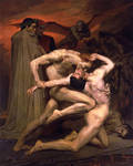
640px-William-Adolphe Bouguereau (1825-1905) - Dan by Moni3
Beauty: 7/10 for those beautifully lit figures and the musculature, even with the weird demon flying thing what even is that?
Challenge: Because it equates violence, strength, and struggle with beauty 7/10
Design: Can you imagine having this on the wall when your in-laws come over? That's pretty funny. They might like it. 3/10
Emotional impact: It makes me a drooling idiot and sparks some kind of primordial fear, so 8/10.
Identity: I can thankfully say I identify with this only when I am overwhelmed with struggle, but when I do this seems to be the first image that comes to my mind. 5/10
Skill: Unfathomable. 10/10

Copyright law keeps me from including other works that are more recent, regrettably, otherwise I would include works by Edward Hopper and Norman Rockwell.


These factors may grow and change throughout your life. What you find you appreciate now you might not in the future. Or, if you're older, you may remember being drawn to a work of art for a particular reason that no longer means as much to you. This is why art is so interesting. It reveals more about us as individuals than it decorates our walls and lives.


Join the community to add your comment. Already a deviant? Log In
Hey, I did an interview with a group here on dA that concentrates on traditional art--aptly called Traditionalists--and a group called TheCeilingsFloor. Somehow this makes me a Traditionalist. Microwaves: how do they work?

Read it! Comment! Start controversy!


Join the community to add your comment. Already a deviant? Log In
Featured

My Strange Encounter With an Art Thief on dA by Moni3, journal

Moni's Condensed Guide to Art Appreciation by Moni3, journal

Moni's Guide to Art Appreciation by Moni3, journal

Interview at Traditionalists by Moni3, journal